
Everything in this guide happens in the Shopify theme editor, with no Liquid, no apps and nothing that can break your store. It is for merchants and marketers who want to make the theme they have look and behave like their brand. If you need to build new sections with code, that is the custom Shopify sections guide; if you have not picked a theme yet, read how to choose a Shopify theme and free vs paid Shopify themes. The last section of this guide tells you exactly where no-code stops and a developer starts.
Before you touch anything: duplicate the theme
In Shopify admin, open Online Store, then Themes, find your live theme and choose Duplicate from its menu. Rename the copy with a date. Do every change below on the copy, using Preview to check it on your phone, and publish only when you are happy. The live theme stays untouched, and if something goes wrong you publish the previous version back in one click. This one habit removes almost all the risk of theme customization.
How the theme editor is organized
Open the copy with Customize. On the left is the list of sections for the template you are viewing; in the middle the live preview; on the right the settings for whatever you selected. Three ideas explain everything:
- Templates. The top dropdown switches between homepage, product, collection, cart, blog and other templates. Each template has its own sections.
- Sections and blocks. A section is a horizontal band of the page (a slideshow, a featured collection, a rich text area). Blocks are the items inside it (each slide, each column, each icon). Sections can be added, reordered by dragging, hidden with the eye icon and removed. Modern themes let you add sections to every template, not only the homepage, and newer themes add nested theme blocks so you can compose layouts inside a section without code.
- Theme settings. The gear icon at the bottom left opens store-wide settings: colours, typography, layout widths, buttons, badges, social links, favicon, currency formatting and, in most current themes, a custom CSS field.
Colours and colour schemes
Current themes use colour schemes: named sets of background, text, button and accent colours that any section can pick from. Set up three or four schemes in theme settings (default, inverse, accent, subtle), then assign a scheme per section instead of colouring sections one by one. It keeps the store consistent and lets you re-theme a campaign by editing one scheme. Check contrast on the scheme with your body text colour; light grey on white looks elegant in the editor and unreadable on a phone in daylight.
Fonts and typography
Theme settings let you choose heading and body fonts from Shopify’s font library, set base sizes and scale. Pick two fonts at most, set the body size for mobile reading first, and keep heading scale modest; oversized headings are the most common reason product pages need extra scrolling on phones. If your brand uses a font that is not in the library, that is one of the few things you cannot do from the editor: custom font files need a small code change (uploading the files and declaring them in the theme), so add it to the developer list at the end.
Header, footer and navigation
The header and footer are sections like any other, edited from any template. In the header, set the logo and its size, choose the menu, decide whether the header sticks on scroll, and add the announcement bar section above it for shipping thresholds and promos. Menus themselves are edited in Online Store, then Navigation: build the main menu with nested items for a dropdown or mega menu, keep it to the categories people actually shop, and give the footer menu the trust links (shipping, returns, contact, about). Every theme handles mega menus differently, so preview the menu on mobile, where it becomes a drawer.
Homepage layout with sections
A homepage is a stack of sections, and the order is a merchandising decision. A structure that works for most stores: a hero with one message and one button; a featured collection or a set of collection tiles; a trust or benefits row; a second collection or a product spotlight; social proof; a newsletter or the footer. Add sections with Add section, drag to reorder, and use the eye icon to hide seasonal sections instead of deleting them. Keep the total short; a homepage with fifteen sections loads slowly and nobody scrolls to the twelfth.
Product pages: settings, then templates
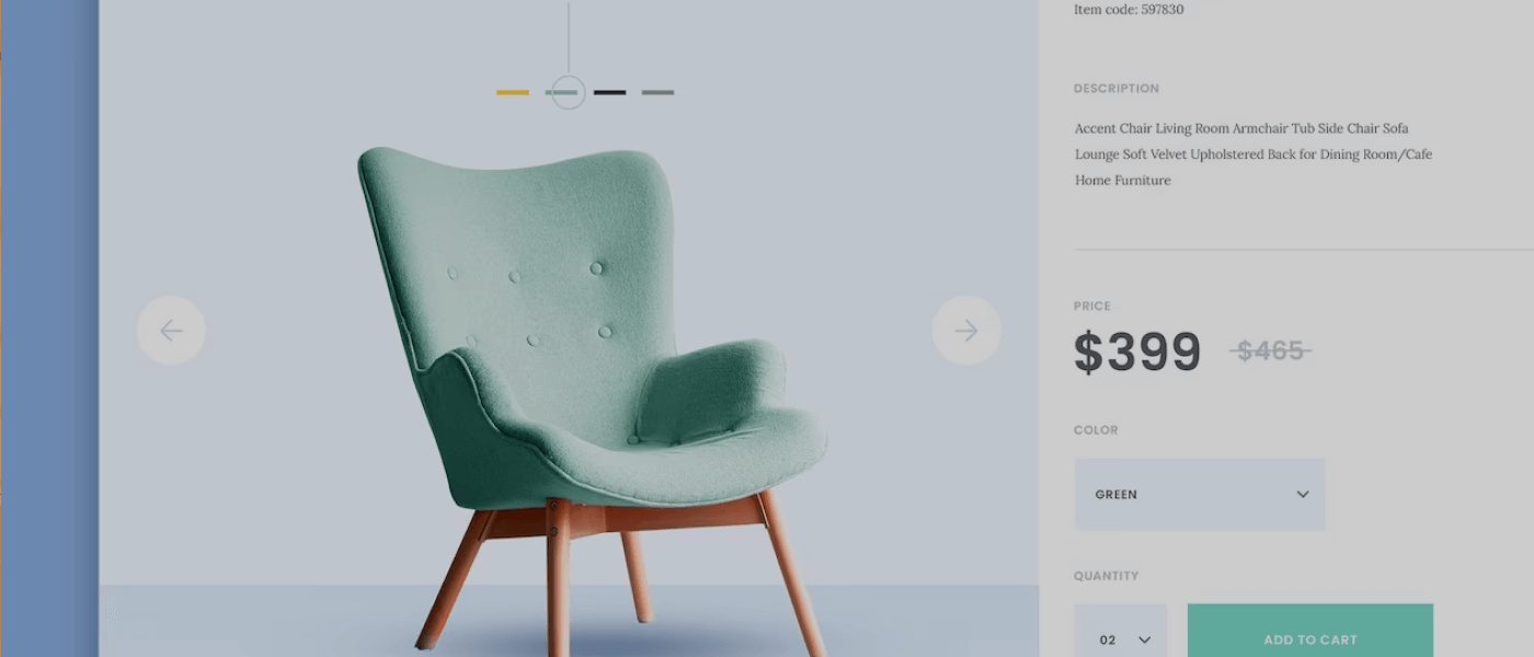
The product template controls every product by default. In the editor you can reorder the elements of the product information section (title, price, variant picker, buy buttons, description, collapsible rows for shipping and care), turn on image zoom and a sticky add-to-cart in themes that offer it, and add sections below (complementary products, reviews, a size guide in a rich text section). When one group of products needs a different layout, create a new product template from the template dropdown, customize it, then assign it to those products from the product’s admin page. That is how stores run a different layout for bundles or gift cards without touching code.
Collection pages and filters
Collection templates control the grid density, image ratio, whether prices and quick-add show, and the filter and sort sidebar. Filters come from Shopify’s Search & Discovery app, which is free: turn on the filters you want (availability, price, size, colour and any product metafield) and the theme renders them. Add a collection banner section for hero images and a rich text section at the bottom for the collection description that search engines read.
Metafields: show product data without code
Many themes can display product metafields — material, dimensions, care instructions, a size chart, an ingredients list — through the editor. Define the metafield once in Settings, then Custom data, fill it in on each product, and in the theme editor connect a text block, an image block or a collapsible row to the metafield with the dynamic source icon. Every product then shows its own value in the same layout. This replaces the habit of pasting specifications into the description and keeps product pages consistent; it is also the data that agents and search engines read most reliably.
Announcement bars, promos and seasonal changes
The announcement bar section above the header takes rotating messages with links: shipping threshold, current promotion, delivery cut-off before a holiday. Seasonal homepage changes are best handled by hiding and unhiding sections with the eye icon rather than rebuilding them; keep a “Black Friday” slideshow hidden all year and reveal it in November. For a campaign landing page, create a new page template from the template dropdown, add sections to it, assign it to a page, and your marketing team has a landing page builder without an app.
Images: the settings that keep the store fast
Image settings live in each section: aspect ratio (choose one ratio for product grids and stick to it, or the grid will jump as images load), image size and focal point on banners. Upload images at a sensible size before they reach the theme — a hero does not need to be 5,000 pixels wide — and let Shopify’s CDN create the responsive versions. Avoid stacking image-heavy sections at the top of the homepage; the first screen should carry one hero and load fast. If the store still feels slow after that, the cause is usually apps and scripts, which is a developer topic covered in our speed guide.
Custom CSS: the last no-code stop
Most current themes have a Custom CSS field, both per section (in the section’s settings, at the bottom) and store-wide (in theme settings). It accepts plain CSS rules and applies them on top of the theme without editing theme files, so it survives theme updates in a way code edits do not. Typical uses: adjusting spacing, hiding an element the theme shows and you do not want, changing a button radius, tweaking a font size on one section. Two rules: keep each snippet small and commented with what it does, and test on mobile, because a rule written on desktop can hide something important on a phone.
Preview, test, publish
Before publishing the copy: open the preview link on an actual phone; click through homepage, a collection, a product, the cart; check the menu drawer; add to cart and reach checkout (checkout is not part of the theme, so it will not have changed). Then publish. Keep the previous theme in the library for a week as a rollback, and delete older copies after that so the theme list stays readable.
Where no-code stops: the developer list
You will hit the edge of the editor at one of these points, and that is when to brief a developer rather than force it with apps:
- A section or block the theme does not have (a comparison table, a configurator, a custom product tab layout).
- Custom font files.
- Changes to how a section behaves rather than how it looks: different logic per market, dynamic content from metafields the theme does not display.
- Performance work: the theme is slow and Custom CSS cannot fix a script problem.
- Anything that requires editing the theme’s code files; once you edit code, theme updates from the vendor become a manual merge.
When you get there, the sections guide shows what a developer will build, and our Shopify theme development team can do it in a way that keeps everything else editable in the same editor you have just learned.