
Most Shopify stores get the majority of their sessions from phones and a minority of their revenue. That gap — mobile conversion running well below desktop — is the single most common finding in our audits, and it is fixable without a redesign. This is the checklist we work through, in the order that moves the number. It assumes a current Shopify theme; for the metrics behind it see Core Web Vitals for Shopify, for the product page in depth product page optimization, for the last step checkout optimization, and for making the changes yourself customizing a Shopify theme without code.
First: measure the gap
In Shopify Analytics, compare conversion rate, add-to-cart rate and checkout completion by device for the last 30 days. Then open the store on a mid-range Android phone on a mobile network, not the office Wi-Fi on the newest iPhone. The difference between those two experiences is usually the whole story. Write down the mobile numbers; every item below should move one of them.
1. The first screen
- One message and one button above the fold. A hero that needs scrolling to find the call to action is a hero that does nothing on mobile.
- No pop-up in the first seconds. Delay newsletter and discount pop-ups until intent is shown (a scroll depth, a second page, exit) and make them dismissable with a thumb.
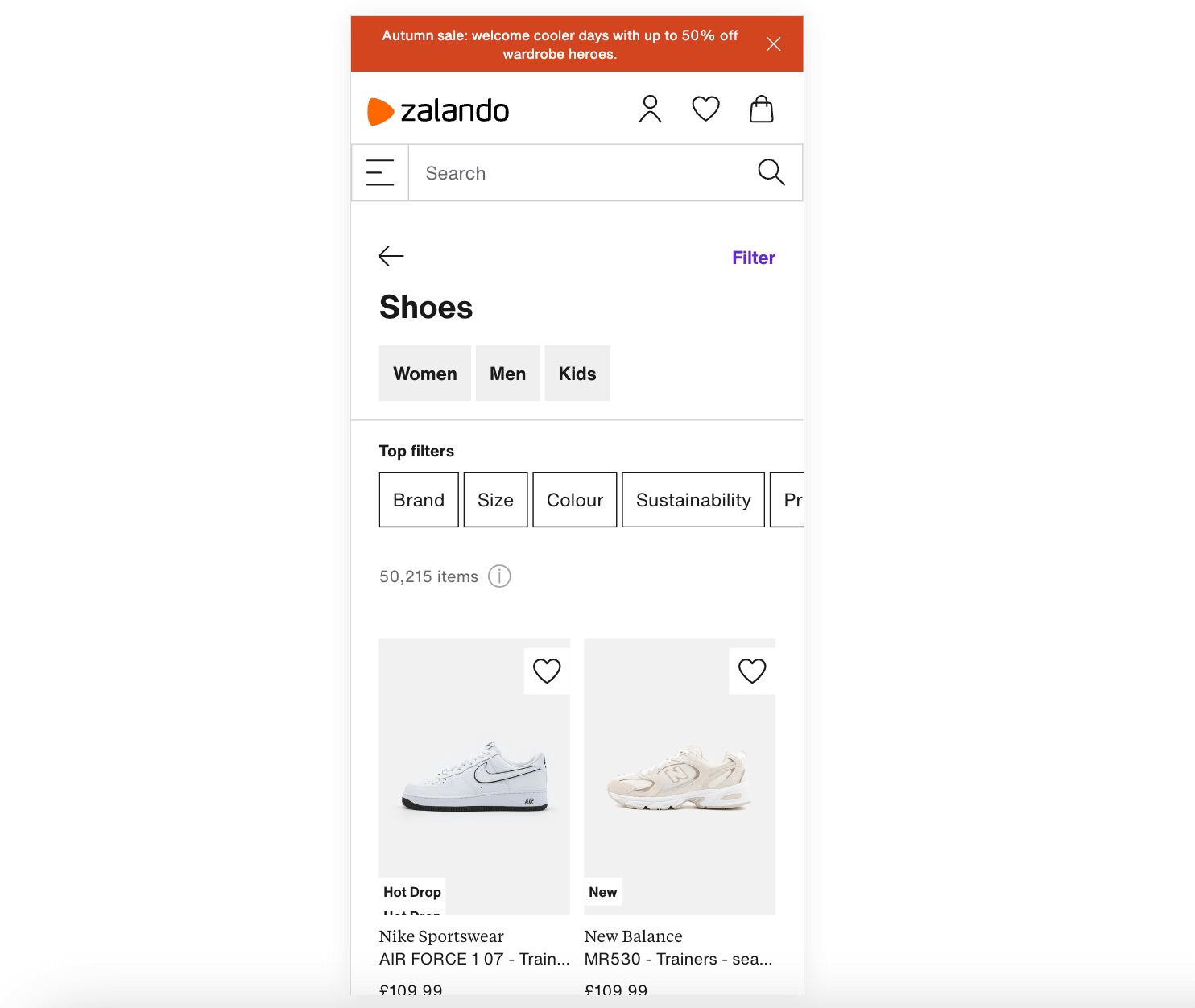
- Announcement bar short enough to fit one line at 360 pixels wide.
- Hero image sized for mobile, not the desktop image cropped by the browser. Most themes allow a separate mobile image; use it.
2. Navigation and search
- The menu drawer shows the top categories first, not the whole tree. Three levels deep is where shoppers give up.
- Search is visible in the header, opens a full-screen input, and returns suggestions with product images. On mobile, search is navigation.
- Filters on collection pages open as a bottom sheet or drawer with an “apply” button and a visible count, and the selected filters stay visible as chips.
- Collection grid: two columns, consistent image ratio, price and availability visible without tapping.
3. The product page
- Product image gallery swipes; the first image loads eagerly and is the Largest Contentful Paint element; zoom works with a pinch.
- Price, variant picker and add-to-cart visible within the first one and a half screens. Variant pickers as buttons, not dropdowns, for sizes and colours; a sticky add-to-cart bar appears when the main button scrolls away.
- Delivery estimate, returns and shipping cost near the button, not in a tab three screens down; this is the information that decides mobile purchases.
- Description in collapsible rows (details, materials, shipping, reviews) so the page is scannable; reviews summary near the price, full reviews further down.
- Product videos do not autoplay with sound and do not load before the images.
4. Cart drawer and cart page
- Adding to cart opens a drawer with the item, the subtotal, a free-shipping progress bar and a checkout button; no full-page reload.
- Quantity controls are tappable targets, not tiny arrows. Remove is one tap with an undo, not a confirmation dialog.
- Express payment buttons (Shop Pay, Apple Pay, Google Pay) appear in the cart, so a returning shopper skips the form entirely.
- Estimated shipping and taxes shown in the cart for the shopper’s market, which removes the biggest checkout surprise.
5. Checkout on a phone
Shopify’s checkout is already mobile-first, so the work is configuration: wallets enabled and shown first, Shop Pay on, guest checkout on, one required contact channel, address autocomplete on, shipping rate names with delivery windows, checkout branding consistent with the store so it does not feel like leaving. The full list is the checkout optimization guide; run it after the storefront items above, because a good checkout cannot save a product page that lost the shopper.
6. Speed on real networks
- Test on a throttled connection and a mid-range device in PageSpeed Insights and in the browser; field data from Search Console is the truth.
- Remove or defer every app script that is not needed on the first screen. Most mobile slowness on Shopify is apps, not the theme.
- Images in WebP or AVIF, served at the viewport size, lazy-loaded below the fold, with width and height set so the layout does not jump (see image optimization).
- Fonts: two families at most, with a system fallback while they load.
- Chat widgets, review carousels and video embeds loaded on interaction, not on page load.
7. Touch, forms and accessibility
- Tap targets at least the size of a fingertip with space between them; links in running text are hard to hit, buttons are not.
- Forms use the right keyboard: numeric for quantities and postcodes, email for email, and autocomplete attributes so the phone fills them.
- Contrast and font size readable in daylight; body text at a size that does not require zooming.
- Focus states and labels present, because accessibility problems show up first on small screens and screen readers, and they are also legal requirements in several markets.
8. Trust signals that fit a small screen
- Returns and delivery promise in one line near the add-to-cart button.
- Star rating and review count next to the price; a payment-methods row in the footer and in the cart.
- Contact options that work on a phone: tap-to-call, WhatsApp or chat with a human answering during business hours.
9. Merchandising for a thumb, not a mouse
- Collections lead with best sellers and in-stock items; a mobile shopper sees six products before scrolling, so the first six decide the visit.
- Bundles and “complete the look” blocks sit under the add-to-cart button as a horizontal swipe, not as a wall of cards.
- Upsells in the cart drawer are one item with one tap to add; a carousel of eight is ignored.
- Promotions are one line with the code pre-applied on tap; nobody types a discount code on a phone from a banner they saw three screens ago.
- Landing pages from ads match the ad on the first screen: the same product, the same price, the same offer, the button visible.
What a mobile audit looks like
When we audit a store for mobile, the report is ten checks scored on a real phone, each with a screenshot and a fix owner: first-screen clarity, pop-up behaviour, menu depth, search usability, collection scan-ability, product page order (image, price, variants, button, delivery), cart drawer friction, checkout configuration, mobile Core Web Vitals from field data, and tap-target and contrast basics. Each check is marked pass, fix in editor, or fix with a developer, and the report ends with the three changes expected to move mobile conversion most. Most stores get the first eight from the theme editor within a week; the ninth is where the developer earns their fee.
Test it the way shoppers use it
Once a week, one person on the team buys something on the live store from their own phone on mobile data, starting from an Instagram or search link, and notes everything that annoyed them. Session recordings filtered to mobile show the rest: rage taps, dead zones, the pop-up that blocked the button. Keep a running list ranked by how many shoppers hit each problem, and fix from the top. Mobile optimization is not a project with an end; it is the weekly habit of using your own store on the worst phone in the office.
Where to get help
Items 1 to 5 and 8 are theme editor work that a store owner can do with the no-code guide. Item 6 usually needs a developer, and it is the one with the largest effect on the conversion gap; our Shopify speed optimization service starts with the same mobile measurement. For a store where the theme itself is the limit, theme development is the honest answer.