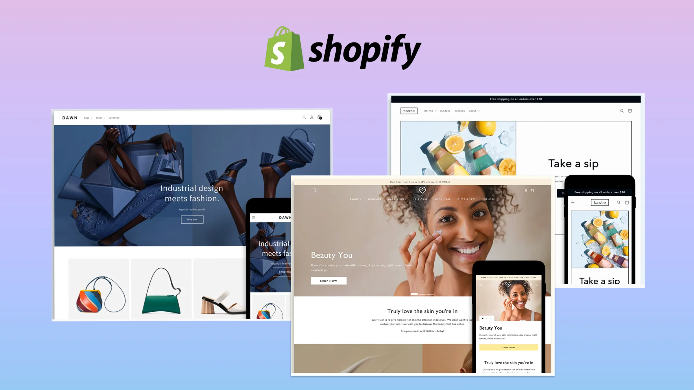

This guide is about one number: the share of shoppers who reach your Shopify checkout and actually pay. It is not about changing how checkout looks (for that, see customizing Shopify checkout and checkout UI branding), not about bugs that silently break it (see Shopify checkout errors), and not about winning back people who already left (see cart abandonment recovery). Everything below happens before the abandonment, in the minutes between “Checkout” and “Pay now”.
Where Shopify checkout actually loses orders
Across e-commerce roughly 70% of carts are abandoned, and in survey after survey the single biggest reason is the same: unexpected extra costs at checkout, cited by about 48% of shoppers who left. The rest of the list is familiar too — being forced to create an account, a long or confusing form, no trusted payment method, slow pages, no visible delivery date. None of these are exotic. They are all things a Shopify store owner controls without writing code.
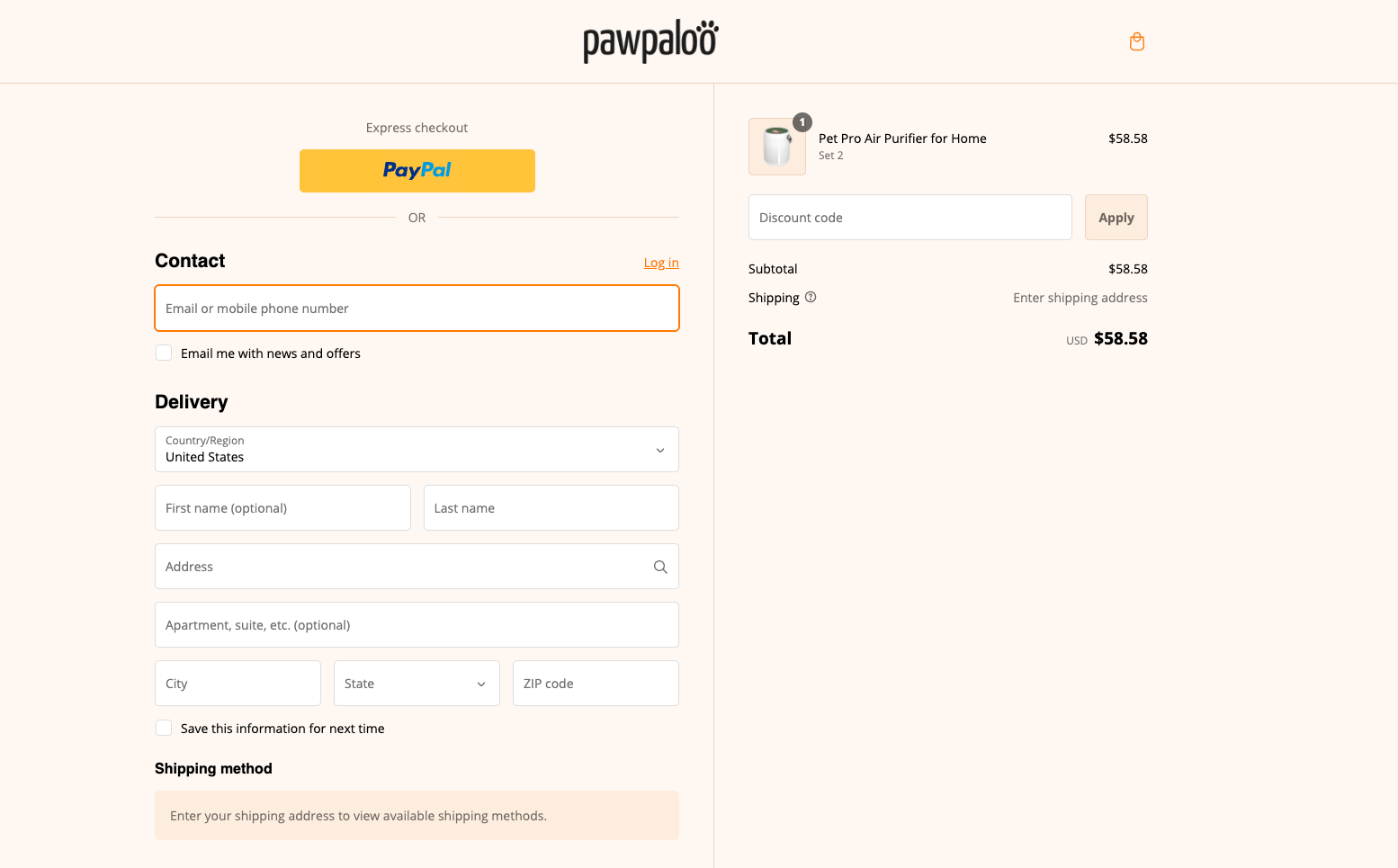
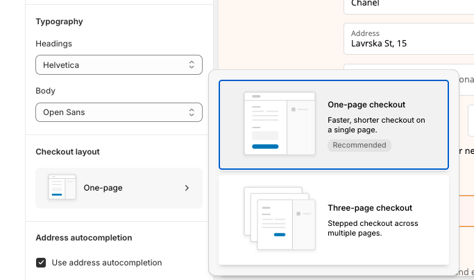
Shopify’s checkout itself is hosted and tuned by Shopify: one page by default, address autocompletion, saved payment details through Shop Pay, and the same infrastructure Shopify Plus brands use. That is good news, because it means the leaks are almost never “the checkout is bad”. They are in what you show before the first field, what you ask for, how shipping and payment are presented, and what you load around it.
Measure before you change anything
Open Shopify Analytics and look at the conversion funnel for the last 30 days: sessions that added to cart, sessions that reached checkout, sessions that converted. Divide completed orders by checkouts started. That ratio, your checkout completion rate, is the only benchmark that matters, because it removes traffic quality from the picture. Write it down with the date. Every change below should move it, and if a change does not move it in two to four weeks, revert it.
Two more views help. The abandoned checkouts report shows at which step people stopped — contact information, shipping, or payment — which tells you which of the four groups below to start with. And a session recording tool for the cart page (not the checkout, which Shopify controls) shows what people do right before they click the button.
Group A — before the first field
1. Show the full cost in the cart, not at the last step
The 48% problem is solved on the cart page. Show estimated shipping (or the free-shipping threshold and how much is left to reach it), show that taxes will be added or that prices include them, and show the currency. A shopper who sees “$29 + $9.90 shipping” in the cart does not feel ambushed when the same numbers appear at checkout.
2. Put express wallets above the form
Shopify shows accelerated checkout buttons — Shop Pay, Apple Pay, Google Pay, PayPal — at the top of checkout when they are enabled in Payments settings. Turn them on, and also enable them on the cart page and product page (dynamic checkout buttons in the theme settings). A returning Apple Pay user on a phone completes the purchase with a fingerprint and never sees your form.
3. Make Shop Pay the default path
Shop Pay stores address and card details across every Shopify store a customer has used. Shopify reports that Shop Pay checkouts convert markedly better than guest checkout; treat that as a vendor claim and check it in your own data, but the mechanism is real: fewer fields, fewer typos, one-tap payment. In the United States, Shop Pay Installments adds buy-now-pay-later without a separate provider.
4. Never force an account
Keep guest checkout on. If you want accounts for repeat buyers, switch to Shopify’s new customer accounts, which log people in with a one-time code sent by email instead of a password. Forced registration is the second most common abandonment reason after cost, and it is a single setting.
Group B — the form
5. Ask for fewer things
In checkout settings, hide the company name and address line 2 unless you ship B2B, and make them optional if you do. Every optional field is one more decision. Shopify already autofills address from the first characters typed, so the form is short by design; do not lengthen it with custom fields unless a shipping rule needs them.
6. Require one contact channel, not two
Choose email or phone as the required contact method, not both. Stores that ship with SMS updates often require phone; stores that live on email flows require email. Asking for both raises friction and lowers the data quality of whichever one people fake.
7. Localize with Markets
If you sell abroad, Shopify Markets lets checkout show local currency, language and local payment methods (iDEAL in the Netherlands, Bancontact in Belgium, Klarna in the Nordics). A Dutch shopper who cannot pay with iDEAL is a lost order, not a delayed one.
8. Check it on a real phone
Most stores see the majority of checkouts on mobile. Shopify handles keyboard types and field sizes, but the order summary, discount-code field and shipping list still need a look on an actual phone: is the pay button visible without scrolling on the payment step, does your logo push the form down, does the summary collapse. Fix what you find in the checkout editor.
Group C — shipping and payment
9. Name shipping rates with a delivery window
“Standard — 3 to 5 business days” beats “Standard”. Shoppers abandon when they cannot tell when the parcel arrives. Order the rates so the most-chosen option is first and pre-selected, and keep the list to three or four options; ten courier variants is a decision nobody wants to make.
10. Use a free-shipping threshold and show progress
A threshold slightly above your average order value raises AOV and removes the single biggest cost objection at once. Show the progress bar in the cart (“Add $12 for free shipping”) so the threshold is a game, not a surprise.
11. Offer local pickup where it exists
If you have a store or warehouse customers can reach, enable local pickup. It is free for them, it removes the shipping objection entirely, and for many local brands it is the most-chosen option once it is visible.
12. Order payment methods by what your customers use
Put the wallet and card options first, buy-now-pay-later second, bank transfer and manual methods last. Remove methods nobody uses in a given market; each extra logo is noise. If you are deciding between Shopify Payments and PayPal as the main gateway, the fee comparison matters here too, because a third-party gateway adds a transaction fee on top of processing.
Group D — trust and speed
13. Make the checkout look like the store, and make policies one click away
In the checkout editor, set your logo, brand colour, font and button style so the checkout does not look like a different website (this branding is available on all plans, not only Plus). Link your shipping and returns policy in the footer of checkout, keep your contact email visible, and show accepted payment icons. Trust badges from apps do less than a consistent, branded page with a clear returns promise.
14. Stop loading things you do not need
The checkout pages are hosted by Shopify and already fast; the slow part is usually what you own around them — the cart page with three upsell apps, a chat widget, two analytics tags and a pop-up. Audit the apps that inject into cart and checkout; remove the ones you cannot name a benefit for. Track conversions with Shopify’s web pixels rather than legacy script tags, which no longer run in checkout since the move to checkout extensibility. A lighter cart page loads faster and pushes people to the payment step with less to distract them. For the store-wide version of this work, see our Shopify speed optimization service.
What needs Shopify Plus, and what does not
Everything in this list works on Basic, Grow and Advanced: wallets, Shop Pay, customer accounts, checkout branding, fields, Markets, shipping rules, payment order, pixels. Shopify Plus adds control over the checkout steps themselves through checkout UI extensions — custom content blocks, upsells inside checkout, custom validation, delivery and payment customizations — plus B2B checkout. Those are powerful, but they are a second wave. Do the 14 fixes first; if the completion rate is still below where you need it, the Plus features are the next lever, and our Shopify Plus agency team can scope them. If you are still on the older checkout.liquid customizations, the checkout extensibility upgrade comes before any of this.
A 30-day order of work
- Week 1 — measure. Record checkout completion rate, the abandonment step breakdown and mobile share. Install session recording on the cart page.
- Week 2 — Group A. Cart cost transparency, wallets on cart and product pages, Shop Pay, guest checkout and new customer accounts.
- Week 3 — Groups B and C. Trim fields, one contact channel, rate names with delivery windows, free-shipping threshold and progress bar, payment order, Markets for the top two foreign countries.
- Week 4 — Group D. Checkout branding, policy links, app audit, pixel migration. Re-measure and compare with week 1.
Most stores that run this sequence see the biggest jump from Group A, because it fixes the cost objection and removes the form for returning shoppers at the same time. Groups B to D add smaller, compounding gains. If the numbers do not move, the problem is likely upstream — product page, offer, traffic quality — and the Shopify conversion rate optimization guide is the next read. Want a second pair of eyes on your funnel? Our Shopify CRO services start with exactly this audit.