
In today's digital age, having a mobile friendly store is crucial for the success of any e-commerce business. With more and more people using their smartphones to browse and shop online, it's essential to optimize your store for mobile devices. This ultimate guide will walk you through the importance of mobile-friendliness, the mobile-first design and development approach, how to optimize your Shopify store for mobile devices, key features of a mobile friendly e-commerce store, testing mobile responsiveness, best practices, tools and resources, benefits, common challenges, and ultimately, how to create a successful mobile friendly store for e-commerce success.
Why is Mobile Friendly store approach Important for E-commerce?
The first section of this guide delves into the importance of mobile-friendliness for e-commerce stores. With the rapid growth of mobile usage, it's no surprise that customers expect a seamless shopping experience on their smartphones. Mobile-friendliness not only improves user experience but also impacts search engine rankings. Google, for instance, prioritizes mobile friendly websites in its search results, making it crucial for e-commerce businesses to optimize their stores for mobile devices. In this section, we will explore the reasons why mobile-friendliness matters and how it can contribute to your overall e-commerce success.
1. The Mobile Revolution
The digital landscape has witnessed a seismic shift with the advent of smartphones. These handheld devices have become an integral part of our daily lives, and consumers are increasingly using them for online shopping. Whether it's browsing products, comparing prices, or making purchases, mobile devices have become the preferred choice for many shoppers. In fact, a significant portion of e-commerce traffic and sales now comes from mobile devices. To cater to this growing market, e-commerce stores must ensure their websites are not just accessible but also optimized for mobile users.
2. Improved User Experience
One of the primary reasons why mobile-friendliness is essential for e-commerce stores is the user experience. Mobile-optimized websites offer a seamless and user-friendly interface that adapts to the smaller screens of smartphones and tablets. Users can easily navigate, view products, and complete transactions without encountering any hiccups. A positive user experience translates to higher customer satisfaction, increased brand loyalty, and ultimately, more sales.
3. Enhanced SEO Performance
Search engines, notably Google, favor mobile friendly websites when ranking search results. Google's mobile-first indexing means that it primarily uses the mobile version of the content for ranking and indexing. If your e-commerce site is not mobile friendly, it may rank lower in search results, potentially reducing your online visibility. With mobile optimization, you can improve your website's SEO performance, which can lead to more organic traffic and higher conversion rates.
4. Reduced Bounce Rates
A mobile-unfriendly website often leads to high bounce rates. When visitors have a poor experience on your site, such as slow loading times, awkward navigation, or distorted images, they are more likely to leave and look for an alternative. By ensuring your e-commerce store is mobile friendly, you can significantly reduce bounce rates and retain a larger portion of your potential customers, increasing the chances of making a sale.
5. Competitive Advantage
In a competitive e-commerce landscape, having a mobile friendly website can set you apart from your competitors. Customers are more likely to engage with and trust businesses that offer a seamless mobile experience. If your website isn't mobile-optimized, potential customers may choose to do business with your competitors who have made the effort to cater to mobile users.
6. Social Media Integration
Social media plays a vital role in the promotion and success of e-commerce stores. Mobile users are more likely to access social media platforms from their smartphones. By having a mobile friendly website, you can easily integrate social media sharing and linking, allowing customers to share products and content with their network, thereby expanding your reach and potential customer base.
7. Mobile Payments and Convenience
Mobile-friendliness also facilitates the integration of mobile payment options, making it easier for customers to complete transactions quickly and securely. The convenience of mobile payments is a significant selling point for many consumers and can lead to higher conversion rates and increased sales for your e-commerce business.
8. Adaptation to Changing Consumer Behavior
Consumer behavior continues to evolve, and mobile shopping is no longer a trend but a fundamental aspect of retail. E-commerce stores must adapt to this change to stay relevant and meet the demands of today's tech-savvy consumers. Failing to do so could result in missed opportunities and revenue loss.
The importance of mobile-friendliness for e-commerce stores cannot be overstated. As more and more consumers turn to mobile devices for their online shopping needs, e-commerce businesses must prioritize mobile optimization to stay competitive, improve user experiences, and maximize their online presence. By doing so, they can tap into the vast potential of the mobile market and ensure their continued growth and success in the digital era.
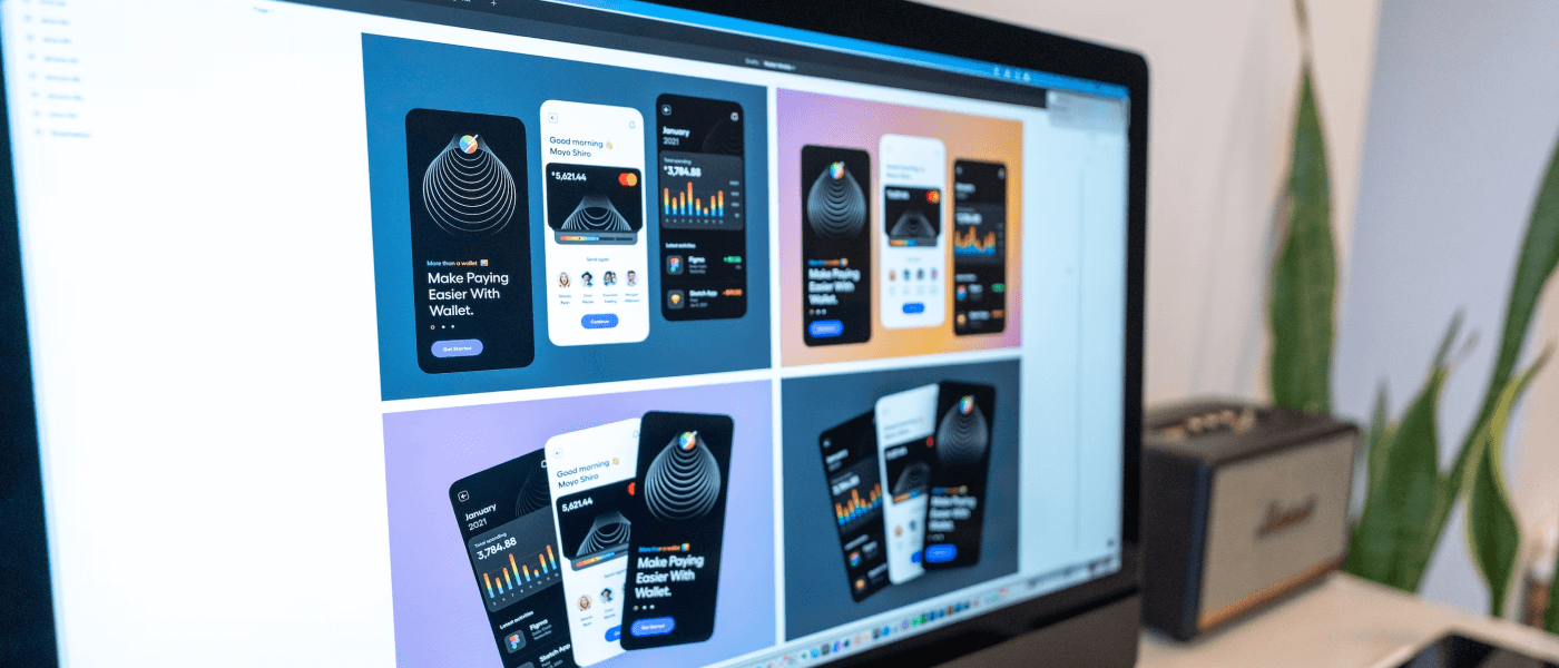
Understanding the Mobile First Design and Development Approach
To create a mobile friendly store, it's essential to understand the mobile-first design and development approach. This section will provide a comprehensive overview of the mobile-first approach, which involves designing and developing for mobile devices first before considering desktop versions. By putting mobile users at the forefront, you can ensure that your store is optimized for smaller screens, touch interactions, and mobile-specific features. We will delve into the principles, benefits, and strategies of mobile-first design and development, equipping you with the knowledge to implement this approach effectively.
How to Optimize Your Shopify Store for Mobile Devices
If you're running your e-commerce store on Shopify, this section is dedicated to helping you optimize it for mobile devices. Shopify is known for its user-friendly interface and flexibility, making it a popular choice for e-commerce businesses. However, it's crucial to ensure that your Shopify store is mobile friendly to provide a seamless shopping experience for your customers. We will guide you through step-by-step instructions on how to make your Shopify store mobile friendly, including optimizing themes, improving page load speed, streamlining navigation, and implementing responsive design techniques. By the end of this section, you'll have a fully optimized Shopify store for mobile devices.
Key Features and Elements of a Mobile Friendly E-commerce Store
In this section, we will explore the key features and elements that contribute to a mobile friendly e-commerce store. From responsive design and intuitive navigation to optimized product images and streamlined checkout processes, there are several components that play a crucial role in creating a seamless mobile shopping experience. We will discuss each of these features in detail, providing insights and best practices to help you incorporate them into your store. By focusing on these key elements, you can ensure that your mobile friendly e-commerce store stands out from the competition and keeps customers coming back for more.
- Testing the Mobile Responsiveness of Your Store
Once you've optimized your store for mobile devices, it's essential to test its mobile responsiveness to ensure a smooth user experience. This section will guide you through various methods and tools to test the mobile responsiveness of your store. From using online emulators and simulators to conducting real-device testing, we will explore different approaches to identify and fix any issues that may arise. By thoroughly testing your store's mobile responsiveness, you can address any potential problems before they impact your customers' shopping experience.
- Best Practices for Mobile-First Design and Development
Implementing best practices is key to creating a successful mobile friendly store. In this section, we will provide a comprehensive list of best practices for mobile-first design and development. From optimizing images and minimizing code to prioritizing speed and ensuring accessibility, these best practices will help you create a store that is not only visually appealing but also user-friendly. By following these guidelines, you can enhance the overall mobile shopping experience and increase customer satisfaction and conversions.
- Tools and Resources for Creating a Mobile Friendly Store
This section will introduce you to a range of tools and resources that can assist you in creating a mobile- riendly store. From design and development tools to performance testing and analytics platforms, there are numerous resources available to streamline the process. We will highlight some of the top tools and resources in each category, providing you with options to choose from based on your specific needs and preferences. By leveraging these tools and resources, you can optimize your store for mobile devices efficiently and effectively.
- Benefits of a Mobile Friendly E-commerce Store
Creating a mobile friendly store offers numerous benefits for your e-commerce business. In this section, we will explore the advantages of having a mobile friendly e-commerce store. From increased visibility and higher search engine rankings to improved user experience and higher conversion rates, mobile-friendliness can positively impact your bottom line. We will delve into each of these benefits, providing real-world examples and statistics to highlight the significance of mobile-friendliness in driving e-commerce success.
Common Challenges and How to Overcome Them
While creating a mobile friendly store is essential, it's not without its challenges. In this section, we will discuss some of the common challenges that e-commerce businesses face when optimizing their stores for mobile devices.From technical constraints and compatibility issues to design limitations and performance concerns, we will explore these challenges in detail. Additionally, we will provide practical solutions and strategies to help you overcome these obstacles and create a mobile friendly store that meets your customers' expectations.
- Responsive Design Issues: Mobile devices come in various screen sizes and resolutions. The challenge is to ensure that your e-commerce website displays properly on all of them. To overcome this challenge, invest in responsive web design. This approach ensures that your website adapts to the user's device, providing an optimal viewing experience.
- Slow Loading Times: Mobile users expect websites to load quickly. If your e-commerce store takes too long to load, it can lead to high bounce rates. Overcome this challenge by optimizing your website for speed. Compress images, use efficient coding, and leverage content delivery networks (CDNs) to reduce loading times.
- Limited Screen Real Estate: Mobile screens are significantly smaller than desktop screens. To overcome this challenge, prioritize the most important content and features. Implement a clean and user-friendly interface with a simplified navigation menu. Utilize dropdown menus and expandable sections to maximize the use of limited space.
- Complex Checkout Process: Lengthy and complicated checkout processes can deter mobile users from completing purchases. Simplify the mobile checkout process by offering one-click payments, guest checkout options, and auto-filling of forms to minimize friction and enhance user experience.
- Touchscreen Navigation: Mobile devices rely on touchscreen navigation, and if buttons or links are too small or closely packed, it can lead to user frustration. Overcome this challenge by ensuring that clickable elements are sufficiently large and well-spaced, making it easy for users to interact with your site.
- Security Concerns: Mobile users are often concerned about the security of their personal and payment information. Overcome this challenge by implementing robust security measures, including SSL certificates, secure payment gateways, and clear privacy policies to instill confidence in your customers.
- Inadequate Testing: It's essential to thoroughly test your mobile e-commerce site on various devices and browsers to identify and resolve any issues. Overcome this challenge by investing in comprehensive testing, including usability testing, performance testing, and compatibility testing across multiple mobile platforms.
- Content Optimization: Mobile devices have limited screen space, and it's essential to optimize your content for readability and relevance. Overcome this challenge by creating concise product descriptions, using high-quality images, and prioritizing essential information. Employ expandable sections for additional details.
- Cross-Device Consistency: Ensure that the user experience remains consistent across devices. Overcome this challenge by implementing synchronized user accounts and shopping carts, allowing users to seamlessly switch between devices while preserving their progress.
- App vs. Mobile Site: Choosing between a mobile app and a mobile-optimized website is a common challenge. Evaluate your target audience and business goals to determine the best solution. An app can offer a more customized experience, while a mobile site is accessible to a broader audience.
Optimize Mobile Experience with Certified Shopify Experts
Creating a mobile-friendly Shopify store goes beyond responsive design — it requires careful attention to speed, navigation, and checkout flow. By working with certified Shopify experts, merchants can ensure their storefront is optimized for mobile performance, offering seamless browsing and faster conversions. A professional approach helps eliminate common pitfalls, providing customers with a smooth shopping journey on any device.
Good examples with good Mobile Friendly Store
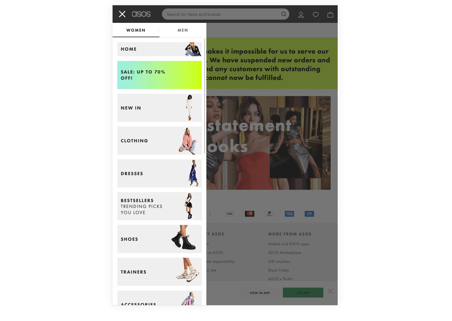
- ASOS: Mobile Fashion on the Go
ASOS, a popular fashion e-commerce retailer, has made a significant investment in its mobile app, tailoring it to fashion-conscious consumers. With an intuitive interface and features like "Visual Search" (which allows users to find products by uploading photos), ASOS has embraced mobile-first design principles to provide an engaging and efficient shopping experience. They also offer features like "Fit Assistant" and "See My Fit" to help customers make more informed clothing choices on mobile devices.
- Poshmark: Resale Fashion at Your Fingertips
Poshmark, a thriving social commerce platform specializing in the resale of clothing and accessories, focuses heavily on its mobile app. With a visually appealing and user-friendly interface, Poshmark encourages users to engage in social selling, buying, and networking all through their mobile devices. The app incorporates features like real-time chat, social sharing, and virtual "Posh Parties" where users can join themed shopping events right from their phones.
- Wayfair: Transforming Home Décor Shopping
Wayfair, an e-commerce store specializing in home furnishings and décor, has embraced mobile-first design to cater to customers looking to enhance their living spaces. With features like Augmented Reality (AR) visualization of furniture in your home and an easy-to-navigate mobile app, Wayfair offers a smooth and immersive shopping experience. Users can virtually place furniture and décor items in their living spaces to see how they fit before making a purchase.
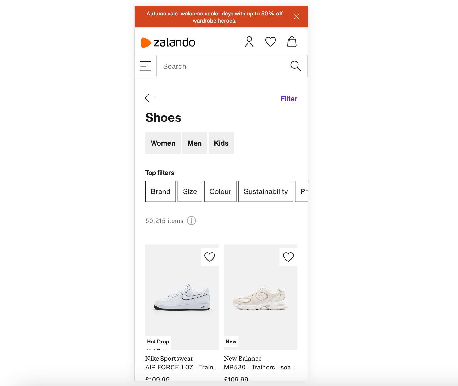
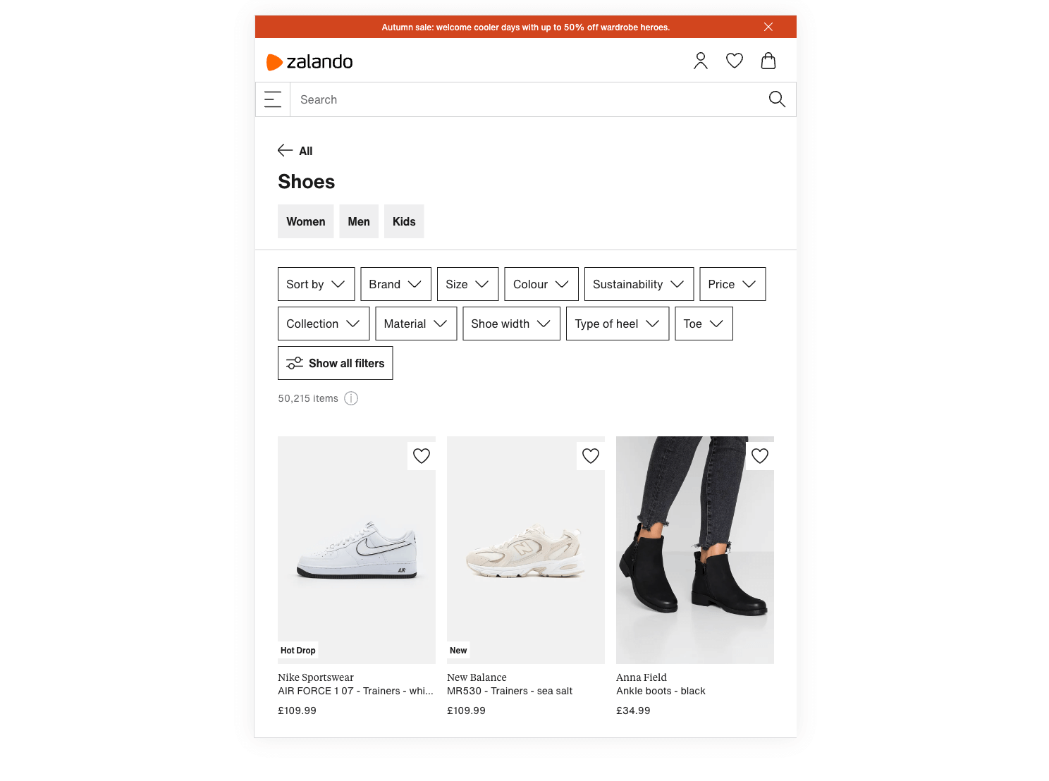
- Zalando: Mobile Shopping for Fashion Enthusiasts
Zalando, a European fashion e-commerce giant, has optimized its mobile app to cater to fashion enthusiasts. With personalized recommendations, detailed product information, and a user-friendly interface, Zalando ensures that users can easily explore and shop for the latest fashion trends on their smartphones. They also incorporate a barcode scanner, making it effortless for customers to find similar items or compare prices while shopping in physical stores.
- Nike: A Sneakerhead's Dream
Nike's mobile app is a prime example of a brand that understands its target audience. Sneaker enthusiasts and athletes can easily explore and purchase the latest Nike products, including exclusive releases and custom designs, all from their mobile devices. The app offers features like AR try-ons and access to the Nike Training Club, catering to the active lifestyle of their customers.
- Sephora: Beauty on the Go
Sephora, the cosmetics and beauty retailer, has a mobile app that caters to beauty enthusiasts. Customers can browse a wide range of products, try on virtual makeup with augmented reality, and access their Beauty Insider loyalty program, all from their mobile devices. Sephora's mobile-first approach includes features like user-generated reviews and detailed product information to assist customers in making informed choices.
- Best Buy: Electronics on the Go
Best Buy, a leading electronics retailer, has a mobile app that caters to tech enthusiasts. Customers can explore a wide range of electronics, read product reviews, and make purchases from their mobile devices. The app includes features like store locator, price matching, and easy access to the My Best Buy loyalty program, enhancing the mobile shopping experience for tech-savvy consumers.
Creating a Successful Mobile Friendly Store for E-commerce Success
In conclusion, creating a mobile friendly store is crucial for e-commerce success in today's mobile-driven world. By understanding the importance of mobile-friendliness, embracing the mobile-first design and development approach, optimizing your Shopify store for mobile devices, incorporating key features and elements, testing mobile responsiveness, following best practices, leveraging tools and resources, and overcoming common challenges, you can create a store that provides a seamless shopping experience for your customers. Don't miss out on the opportunity to tap into the growing mobile market. Start creating your mobile friendly store today and take your e-commerce business to new heights of success.
If you’re in search of a seasoned eCommerce agency to assist you with customizing Shopify stores, we encourage you to get in touch with our Mgroup team for a conversation about mobile performance.